Client
Software
-
- Illustrator
- Photoshop
Year
Deliverables
- Visual identity
- Branding
- Illustrations
- Pattern
Fun and honest
smoothie vendor
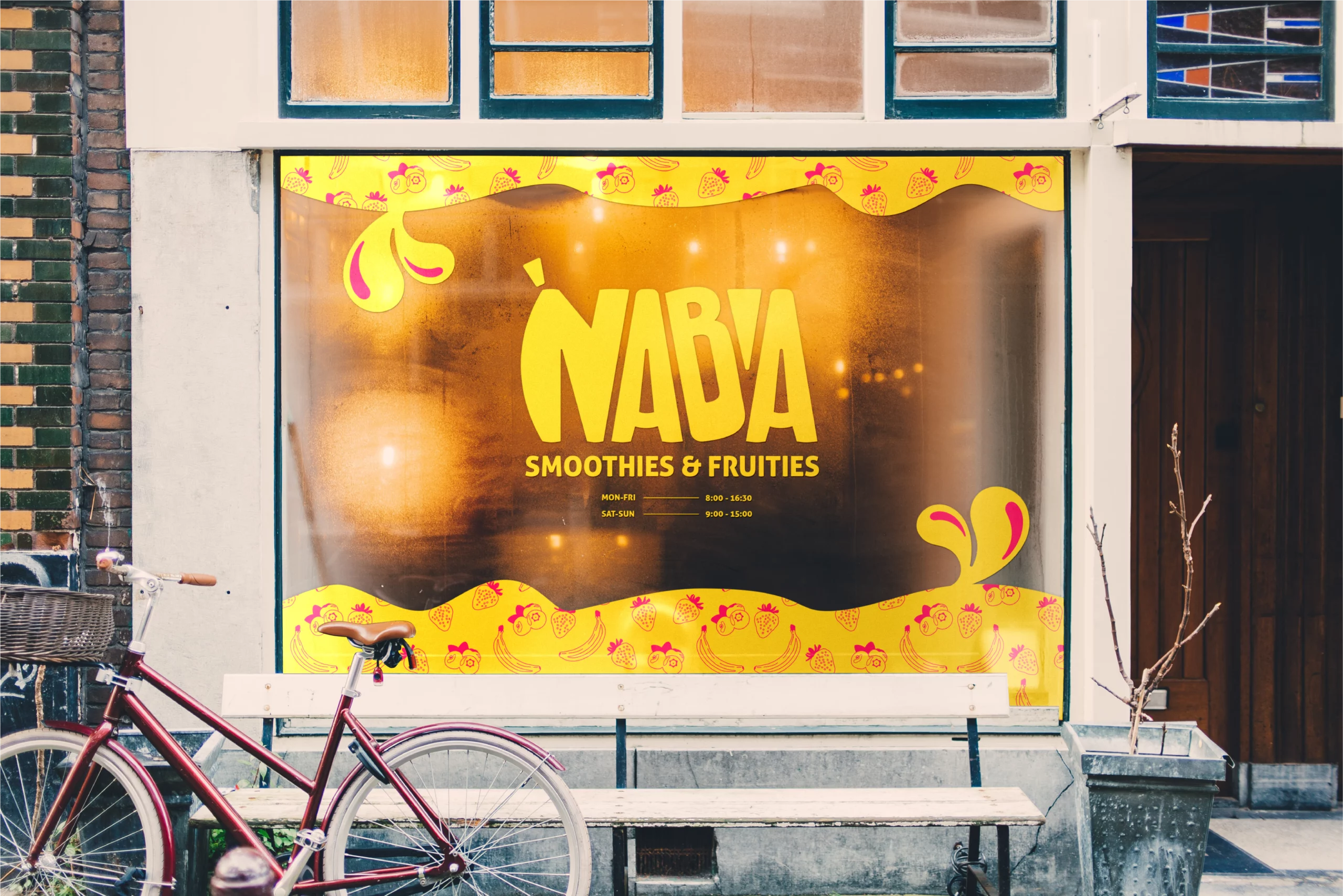
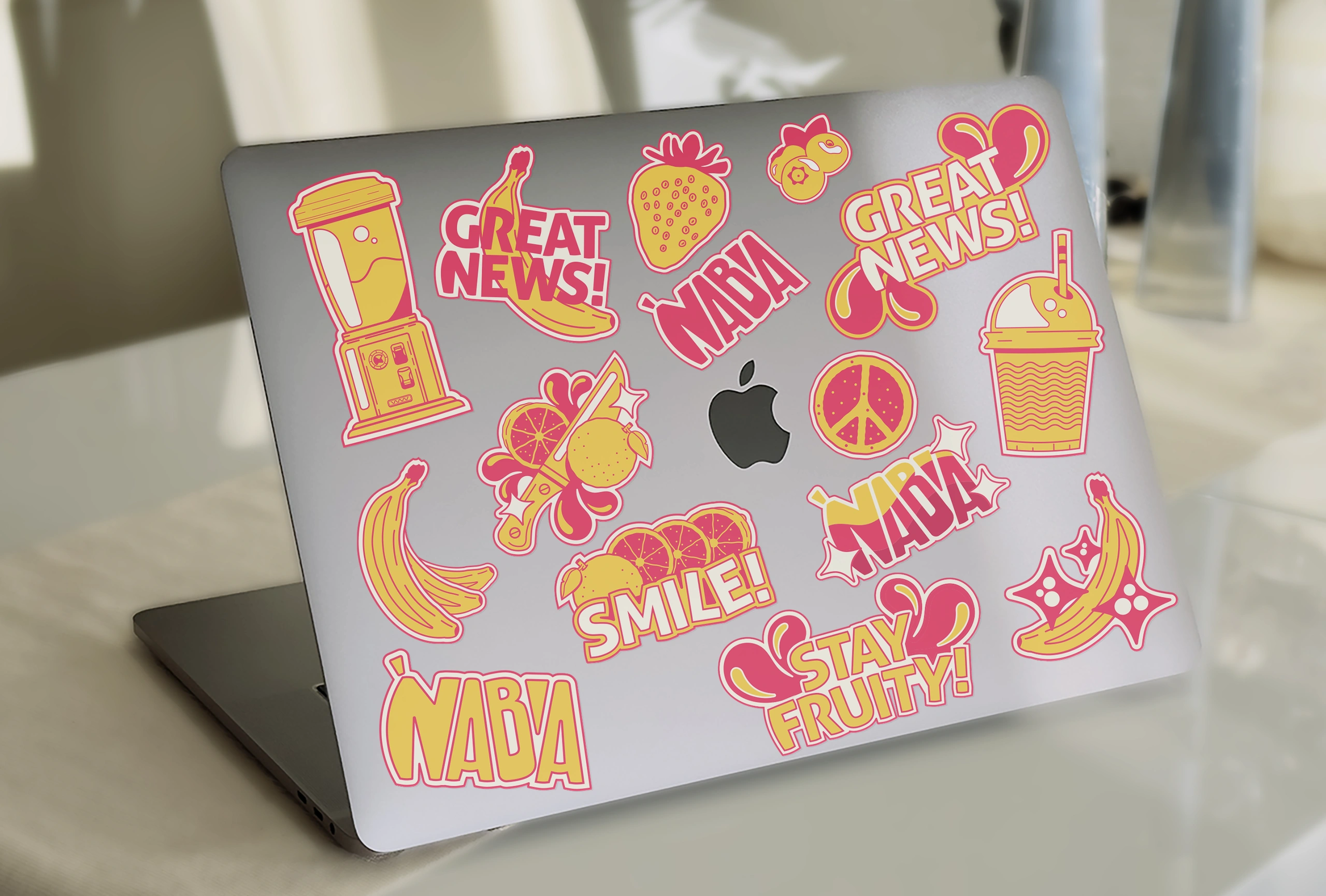
Great news, smoothie enthusiasts! I am thrilled to present Naba, a smoothie shop that is your go-to haven for 100% organic, ethically sourced, and flavor-packed fruit drinks. Naba believes in crafting a wholesome and delightful experience for their customers, making the choice of a healthy beverage an easier decision. Hence they wanted a visual identity to reflect just that – sincerity, care-free, burst of flavor and pure fun.
I embarked on a creative journey to bring the heart and soul of Naba to life through captivating illustrations and a spectrum of vibrant colors.
My goal was to visually convey the great news that Naba delivers not only exceptional taste but also a commitment to organic goodness and fair trade practices. So, buckle up for a colorful ride through my design process, where I’ve harnessed the power of creativity to amplify the greatness of Naba in every pixel, stroke, and hue.




From inspiration to a brand with fun  , enjoyment
  & taste
  at it’s core, let me introduce you to Naba
What does it mean?
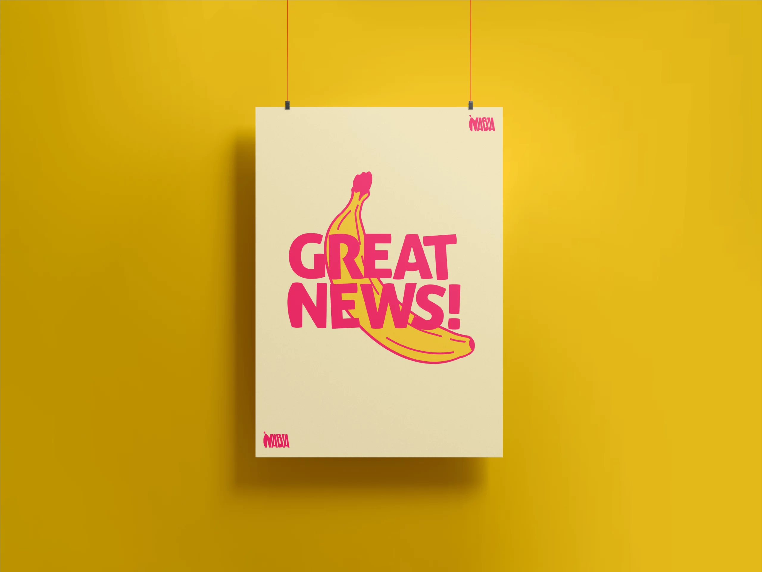
Great news!
The word Naba means “Great News” and stems from the Urdu language. Naba’s product is 100% made from nature, with the sweet taste of delicious fruits! Don’t let the amazing taste fool you, it’s healthy and full of vitamins as well, which is indeed great news for fruit aficionados and their taste buds!
Harmony
Naba’s commodity is stemming from nature. Hence nature and its harmony stood as the foundation in creating the logo. Therefore the “Golden Ratio” was used to achieve visual balance and aesthetic appeal.
Playful
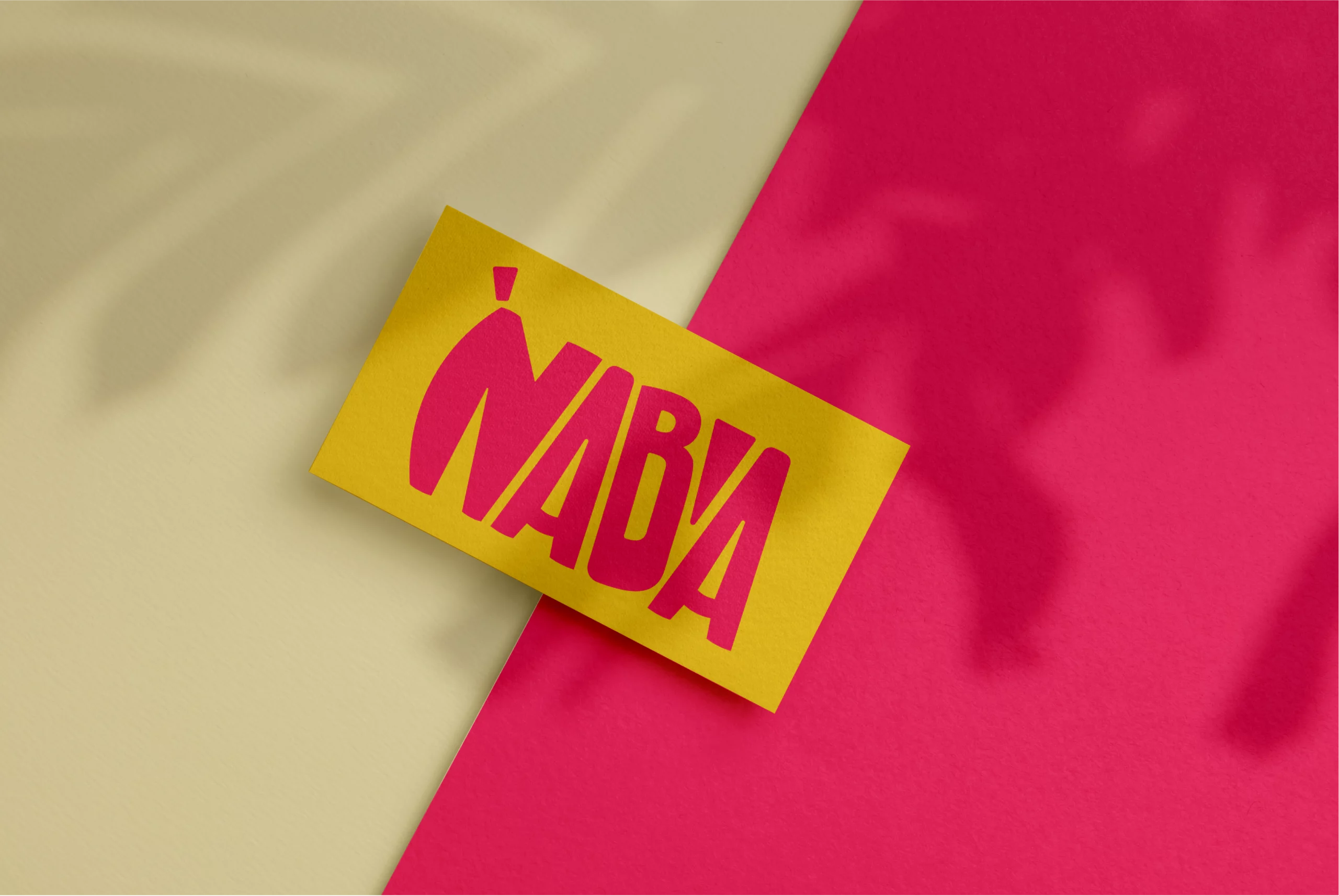
The shapes are organic and smooth with the “N” being portrayed as a banana to underline the denotation of the brand and its commodity. The letter “B” is skewed, while the apostrophe is playful and dictating how the name should be pronounced.
Colors
#262626
#fdeebe
#ff2768
#ffd031
Typography
