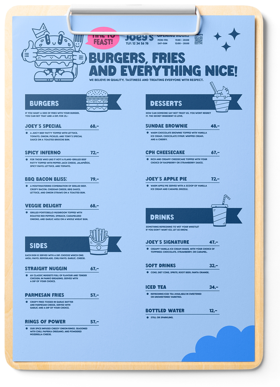

Joey’s
Client
Joey’s (Concept)
Software
- Illustrator
- Photoshop
- Procreate
Year
2023
Deliverables
- Visual identity
- Illustrations
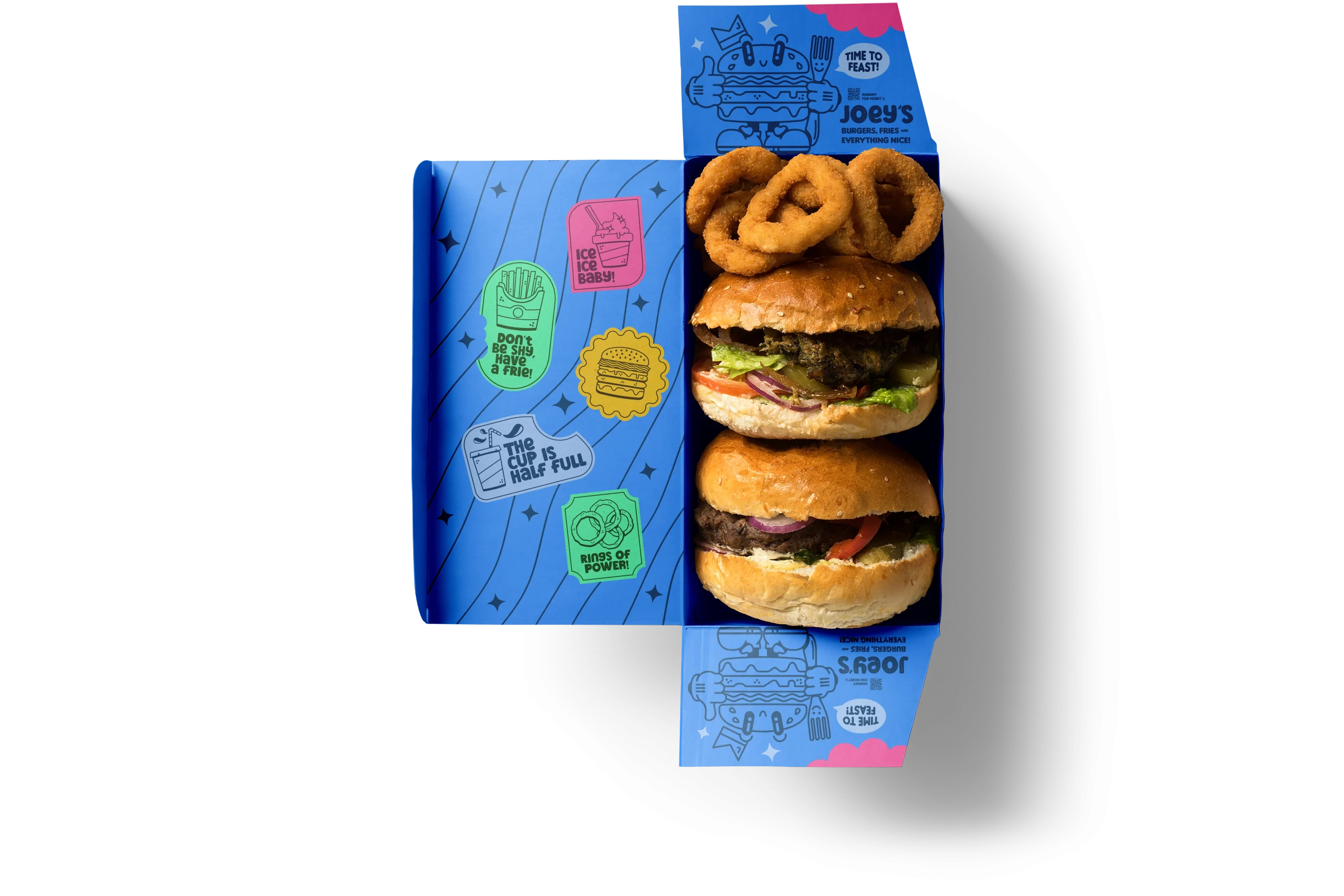
- Packaging
Each bite
tells a savory story!
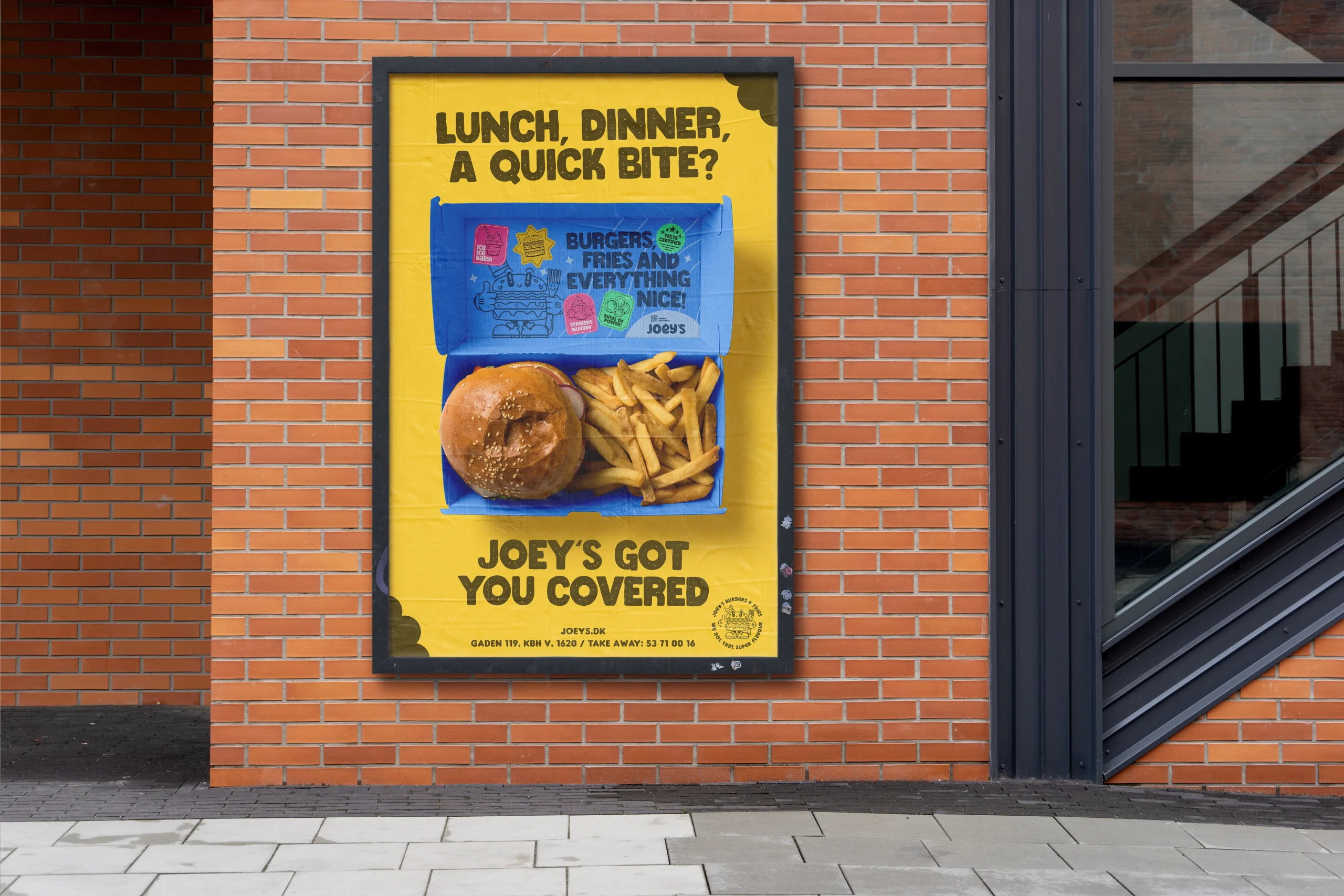
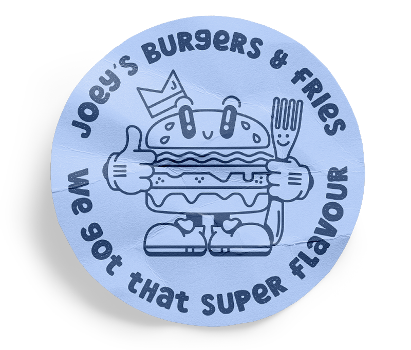
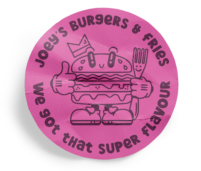
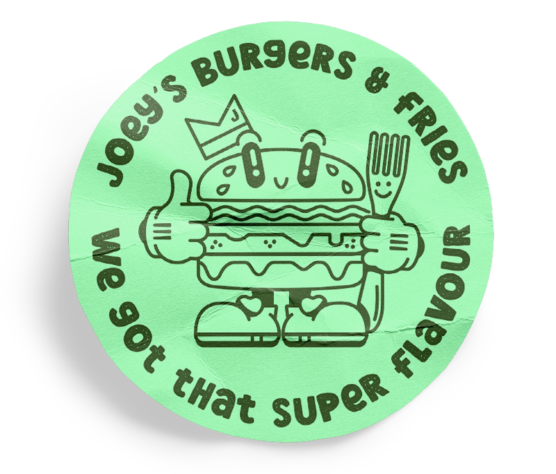
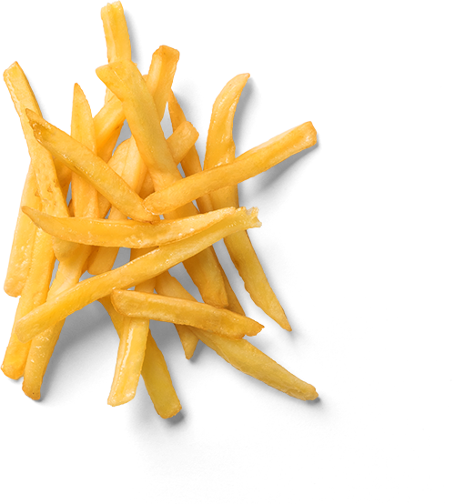
For Joey’s branding, the design approach revolves around capturing the essence of joy and indulgence associated with enjoying a classic burger experience. The logo, featuring a charming burger mascot, serves as the cornerstone of the brand identity, instantly recognizable and inviting. Package designs are vibrant and dynamic, utilizing playful illustrations of burgers, fries, and onion rings to evoke a sense of excitement and anticipation.
Indulge in joy with every taste at Joey’s where burgers are more than a meal, they’re moments of pure happiness.
Each element of the design, from the color palette to the typography, is carefully chosen to convey a feeling of warmth and nostalgia, inviting customers to embark on a culinary journey filled with flavor and fun. Overall, the design case for Joey’s is rooted in creating a visual identity that not only showcases the delicious offerings but also fosters a sense of connection and delight with every interaction.
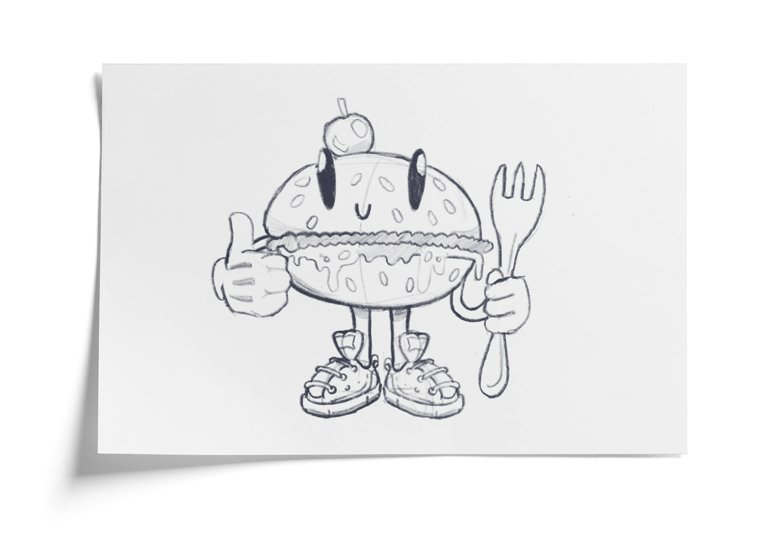
Initial sketch
Colors
#1b4b7a – #479aff – #add2ff
#ff64ac
#64ffb7
#ffd031
Typography
Final solution
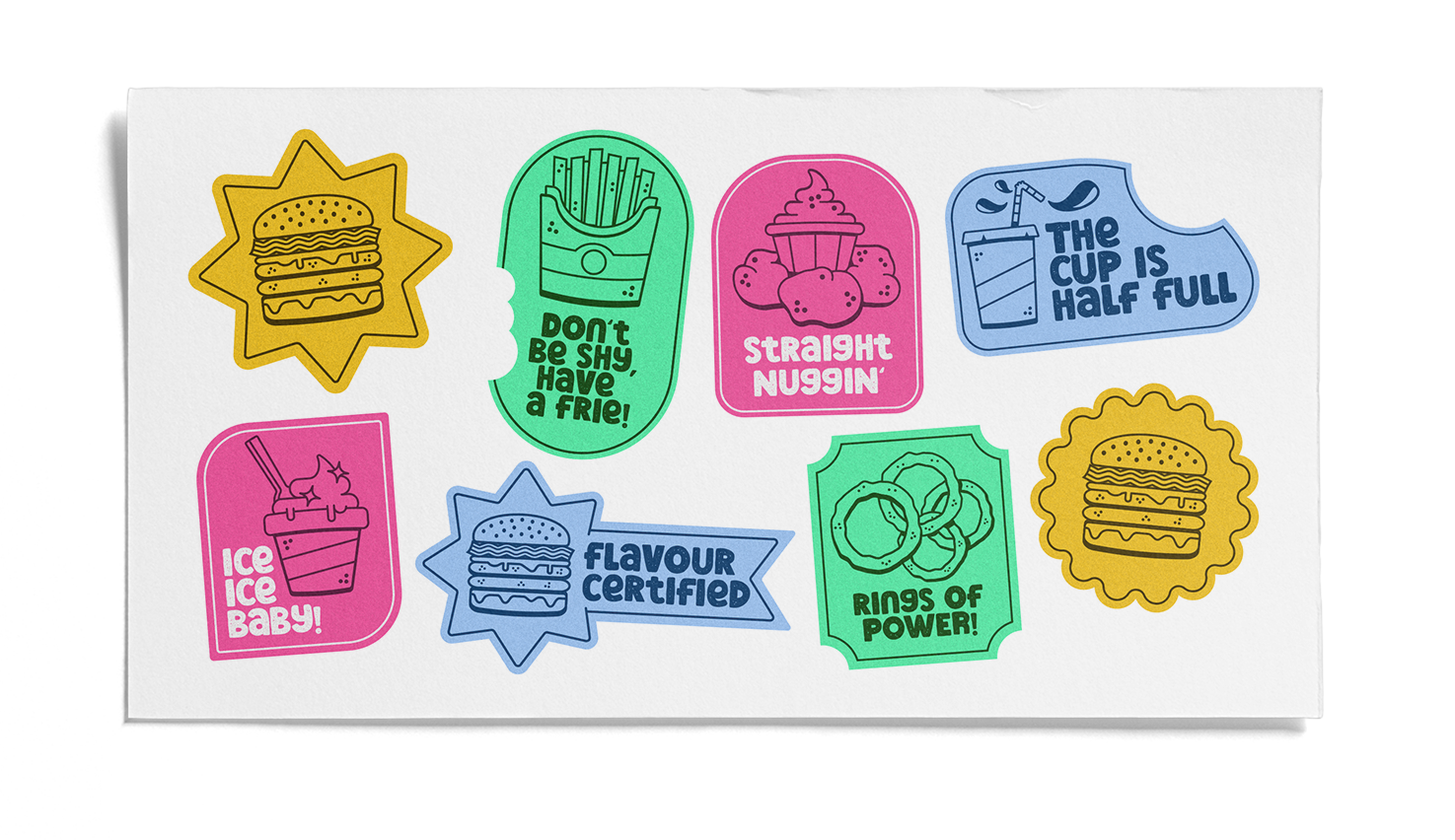
Extra flavour
To accompany the mascot on it’s journey a collection of illustrations was created. These illustrations are to complement the brand and be used in the visual identity and communication.
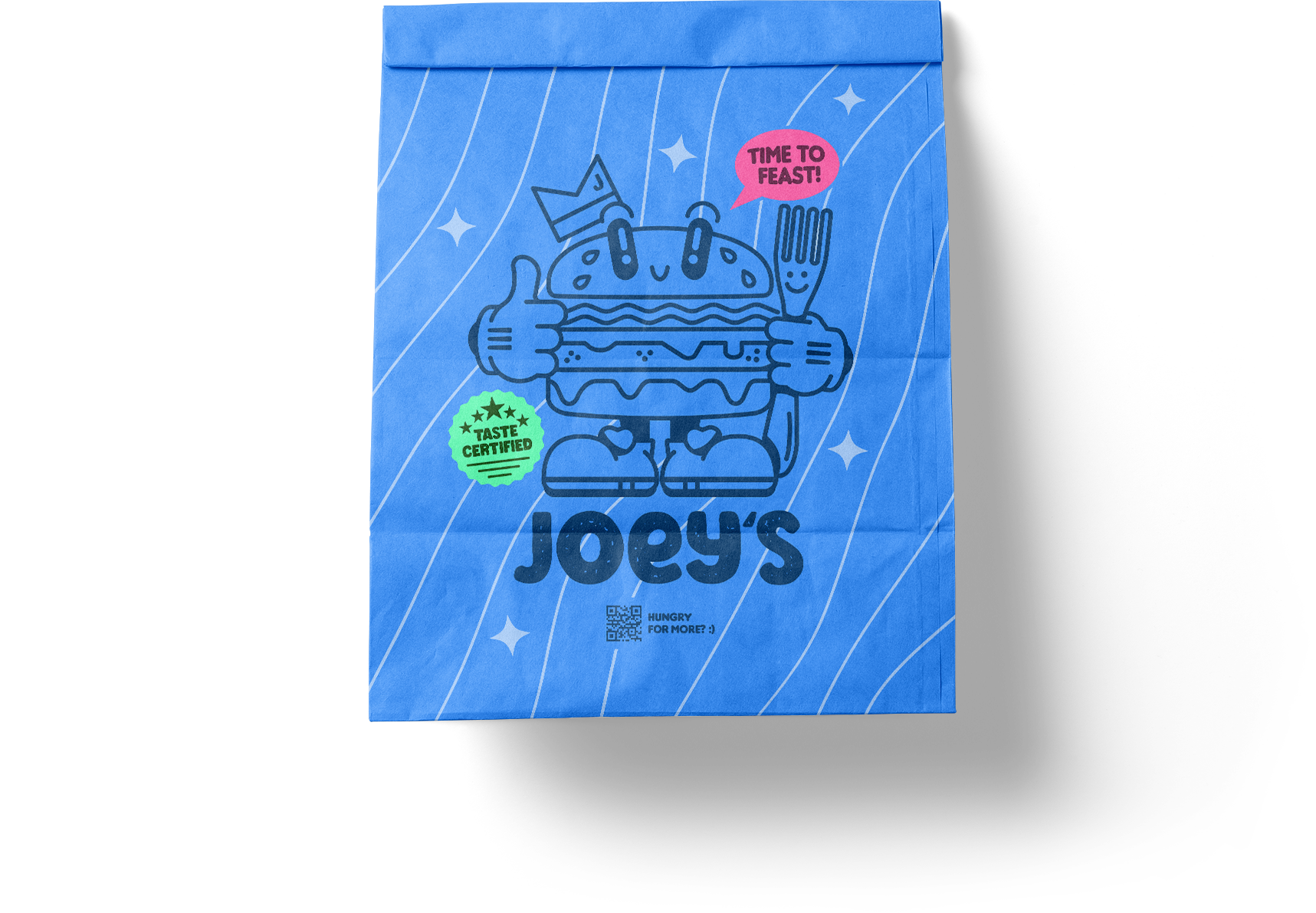
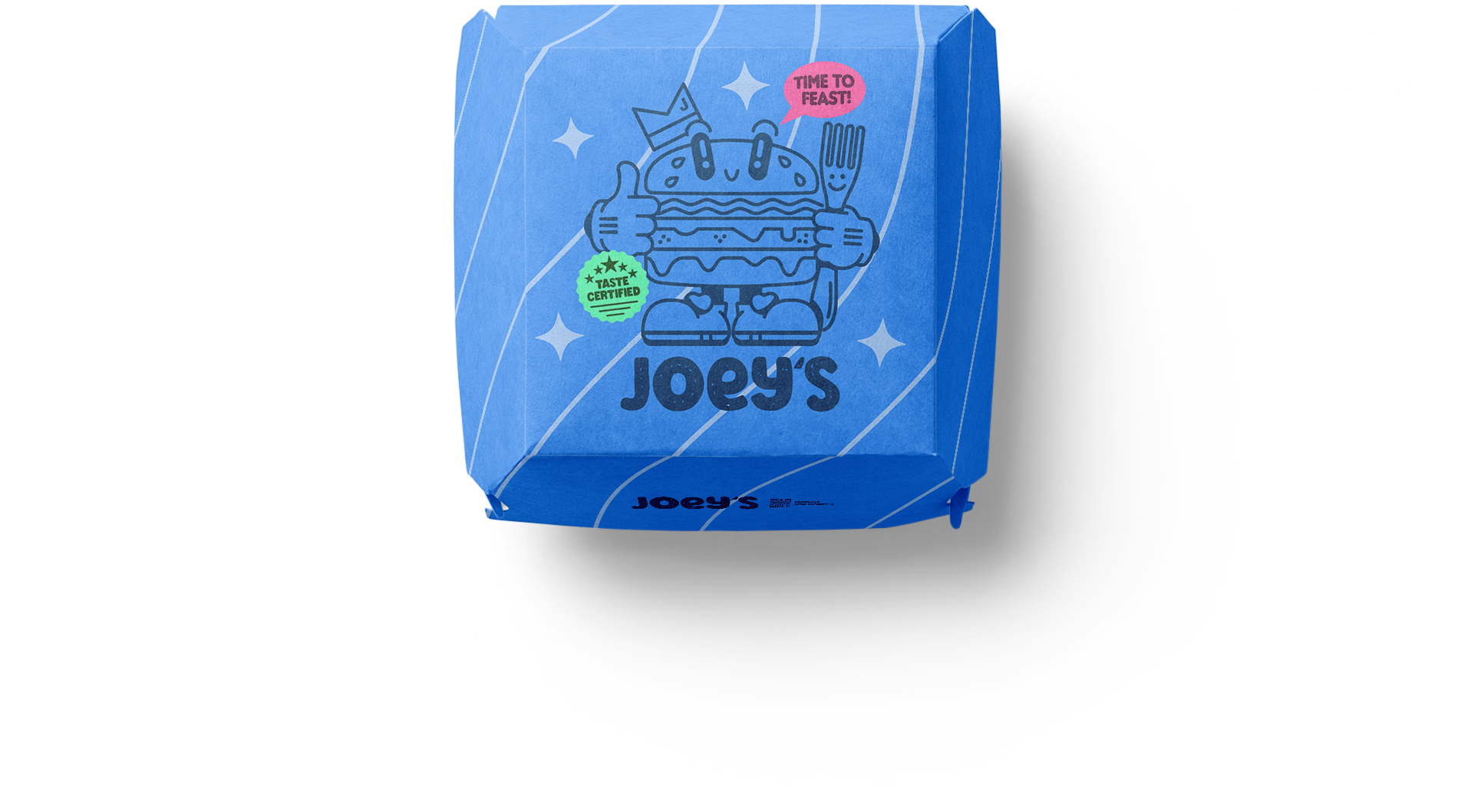
Eye-catching visuals
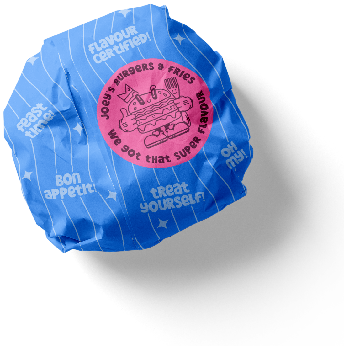
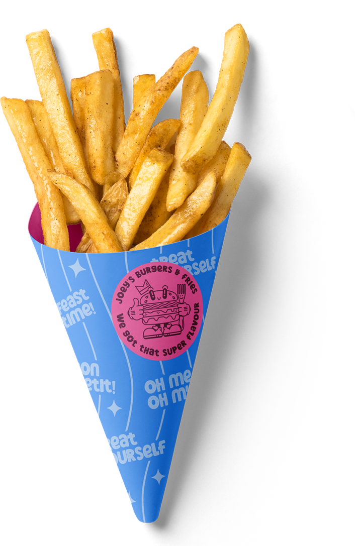
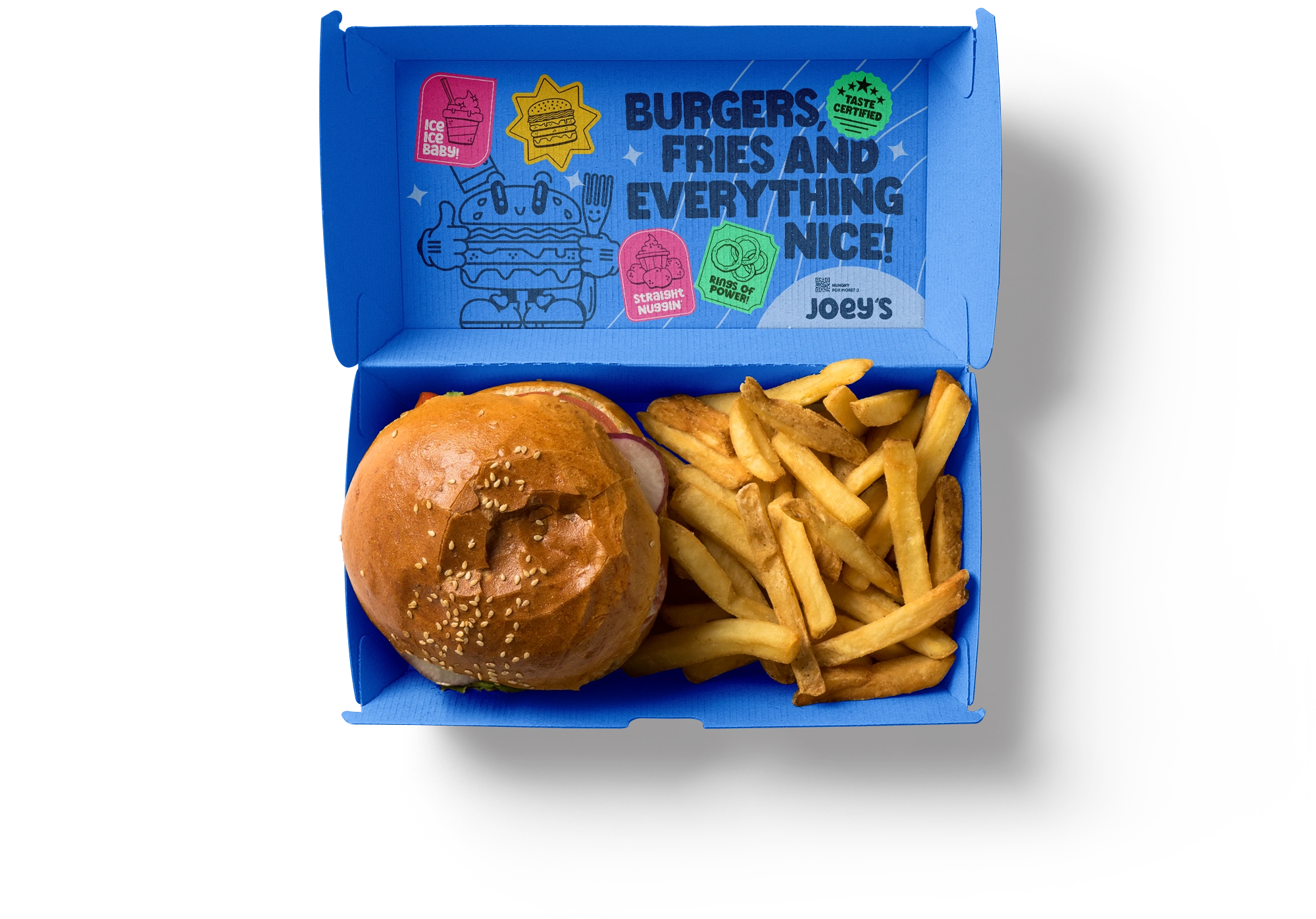
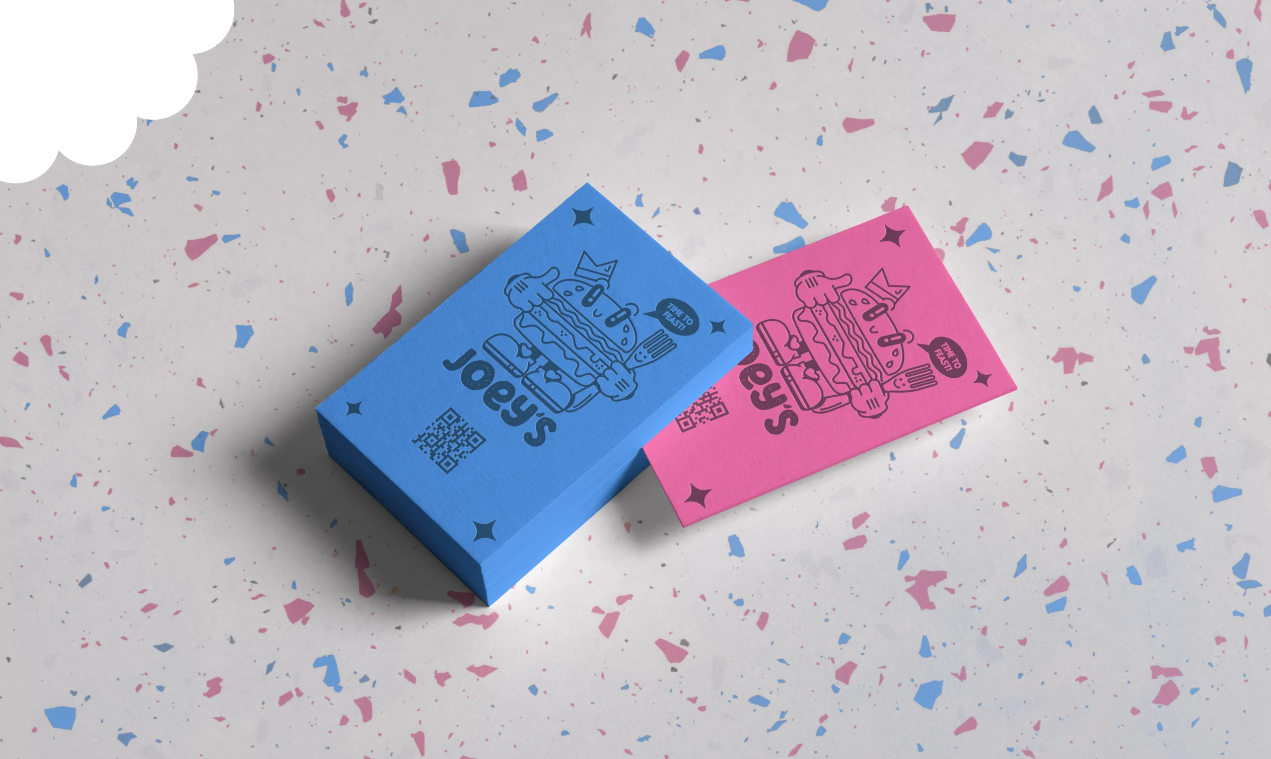
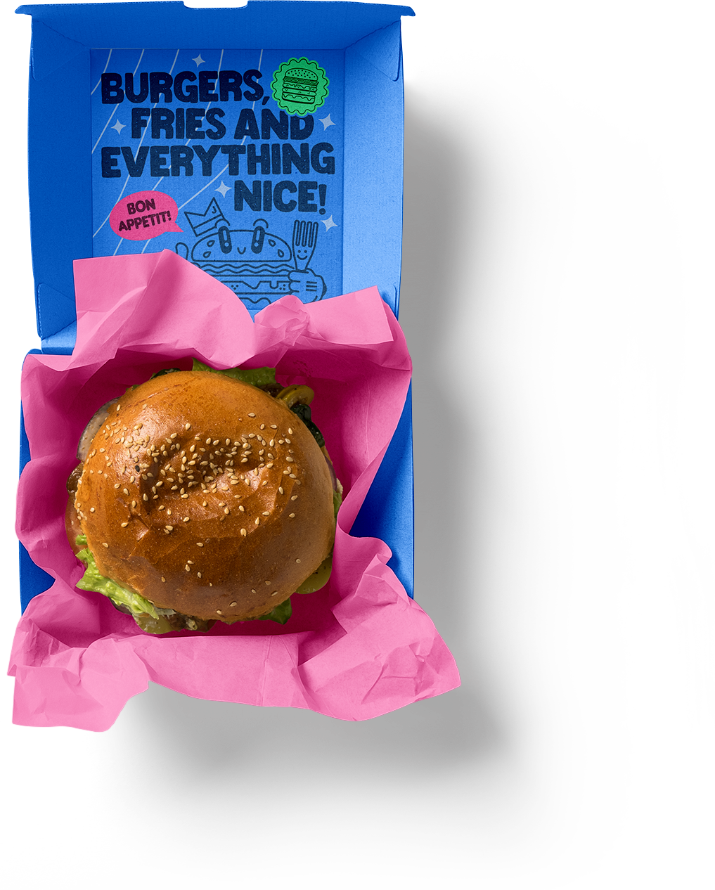
Joey’s burger brand embraces a playful and vibrant packaging design that ignites the imagination. Bursting with lively colors and chibi/cartoony iconography, each package tells a story of fun and flavor. Vivid hues of blue, pink, and green dancing across the boxes, conveying the excitement of indulging in a Joey’s burger.
With every glance, customers are transported into a world where burgers become more than just food-they become companions in a whimsical journey of taste and imagination.