

For All Men
Client
For All Men
Software
- Illustrator
- Photoshop
- Adobe XD
- WordPress
Year
2021 – 2022
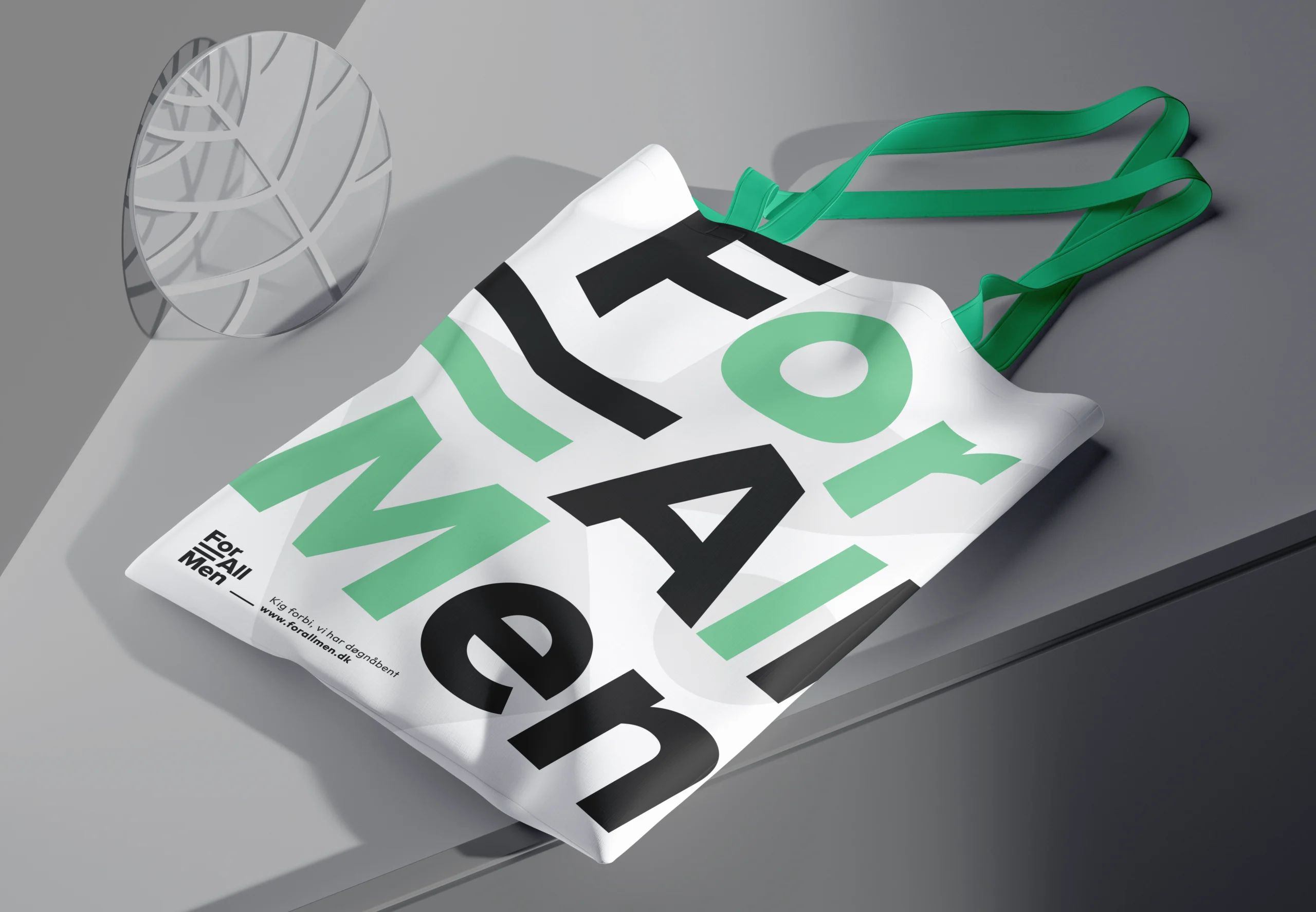
Deliverables
- Visual identity
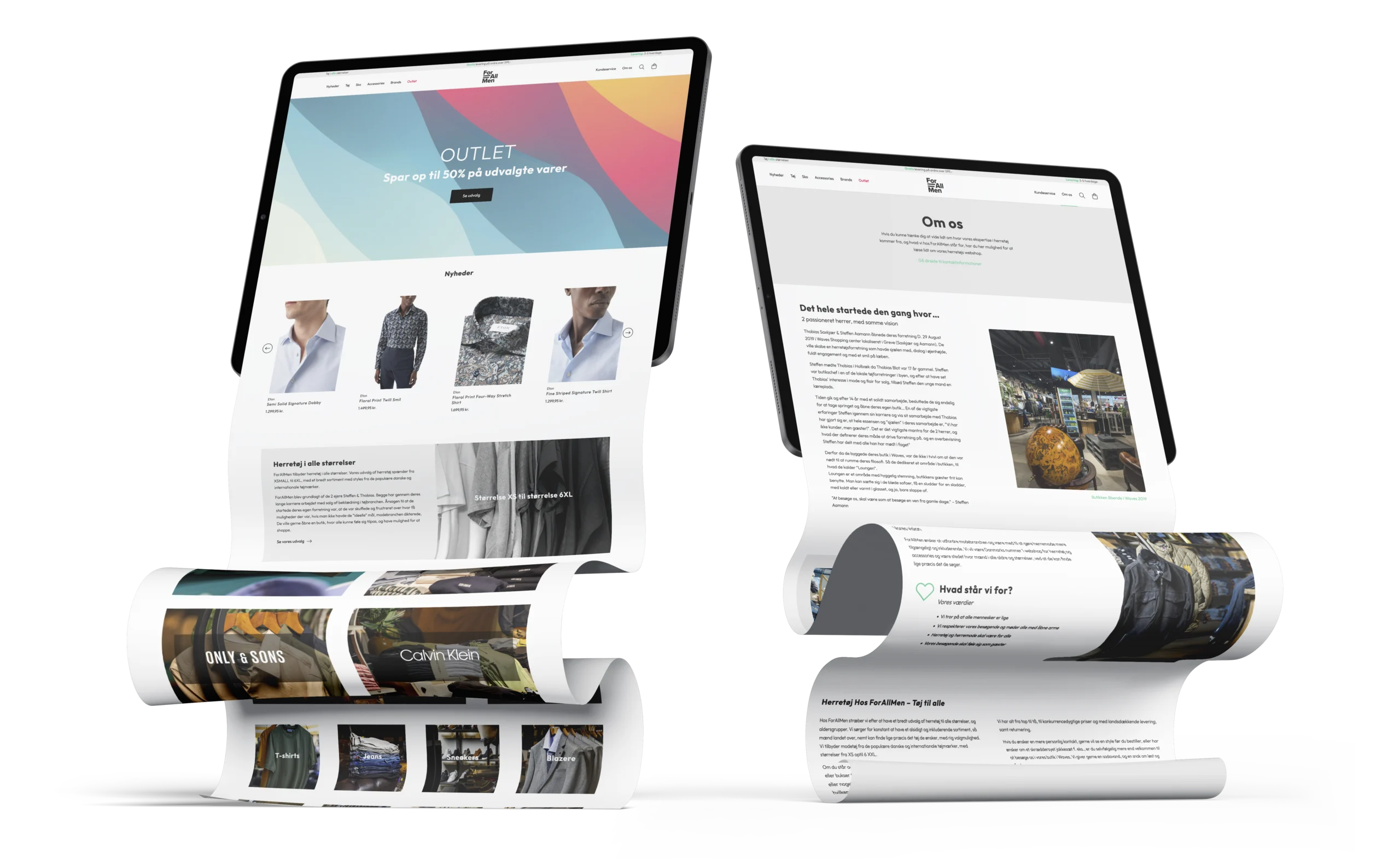
- Webshop
- Graphical assets
Mens attire,
from offline to online.
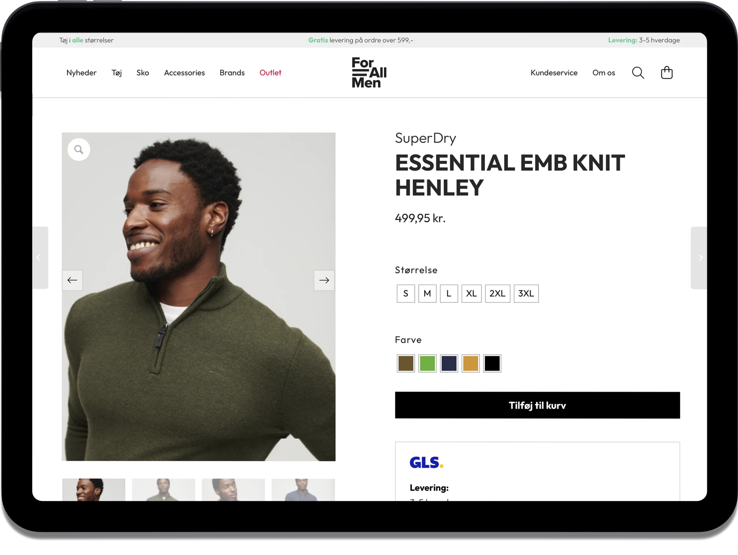
In the dynamic realm of men’s fashion, where style meets individuality, Saxkjær & Aamann, a distinguished men’s wear retailer, embarked on a transformative journey to extend their presence into the digital space. Born as a brick-and-mortar haven for men seeking more than just garments, they envisioned a seamless integration of their physical store experience into the online realm, called For All Men. The goal was to craft a compelling webshop that could work with their stock management system, and resonate with their core values, providing a modern digital counterpart to their existing physical store.
For All Men has the belief that every man is equal, deserving of a shopping experience where personal connections are as crucial as the fashion selection.
To embark on this exciting endeavor, For All Men sought a comprehensive graphic design solution. A visual identity that encapsulates their vision, a logo that becomes the symbol of their commitment to inclusivity, and the creation of a webshop that seamlessly extends the in-store camaraderie to the online space. This graphic design case unfolds as we delve into the process of creating For All Men’s distinctive charm into a captivating digital presence, ensuring that the essence of their physical store is not just retained but elevated in the virtual world.


“From inspiration to a modern and functional webshop, with a sharp minimalistic profile, aimed towards men, this was the outcome”
Colors
#33cc99
#efefef
#343434
#1c1c1c
Typography
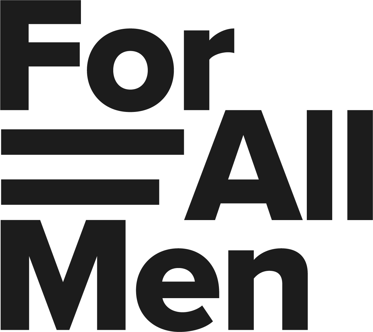
The logo is versatile and can represent many different types of clothing. It is timeless, with a minimalist Scandinavian expression that fits every occasion.
Equal sign: “indicates that the two values on either side of the sign have the same value or meaning” In the For All Men context, it represents that all men are equal and all sizes are welcome.
The “equal sign” has 2 different lengths on the x axis. The reason is to illustrate the diversity in the target audience (men)
The thickness of the letter “L” is identical to the thickness of lines used in the equal sign. This choice was made to align the “weight” of the logo.
The upper case letters in each word are aligned with each other, so that the symmetry is pleasing for the eye.
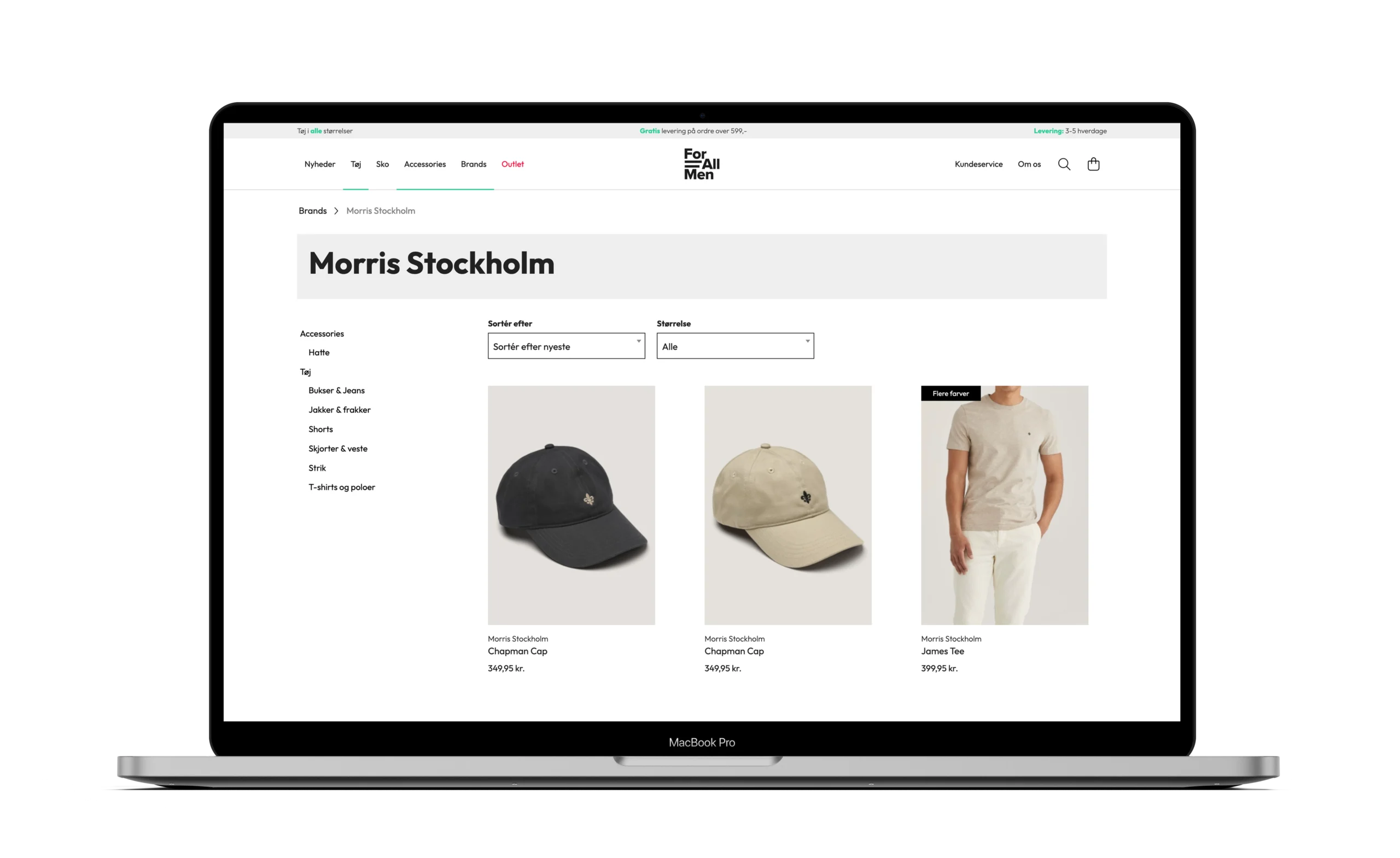
Streamlined day to day management
Stock management,
across offline & online
From the retail store and internal POS system, to implementation with webshop, online data transfer via payment gateway, to freight module (GLS) and to the receiving customer, I was a part of implementing the integrations and executing the setup from A-Z.